

Attractive offers have been part of a good business strategy for millennia. The Internet has only made these deals available online.
And in doing so, it has created unprecedented access and options for sellers and buyers.
How do flash sales work?
In particular, given the ubiquity and immediacy of the Internet, flash sales can be a particularly lucrative tool for stimulating impulse purchases, increasing revenue, and clearing excess inventory.
But the success of flash sales does not only depend on offering prices 40 to 70% lower than normal: the presentation of the offer counts.
You must first capture people’s attention and then skillfully persuade them to buy the product. Designing a flash sale website or web page can be the difference between attracting a large number of buyers and ending up with failure despite prices being significantly lower than your competitors.
There’s no better way to know and apply what works than to learn from shops that have demonstrated the ability to deploy winning designs.
Best Examples of Flash Sales
In this article, we will look at some of the best flash sale website examples. We have deliberately included a mix of globally recognizable brands as well as others that may not be as well known outside of their industry or country.
We do this to demonstrate that a store does not need to rely on the power, reputation and recognizability of its brand to achieve great flash sale success: online stores of all sizes can extract value optimal performance of their flash sale if they get started.
1. Bed Bath and Beyond
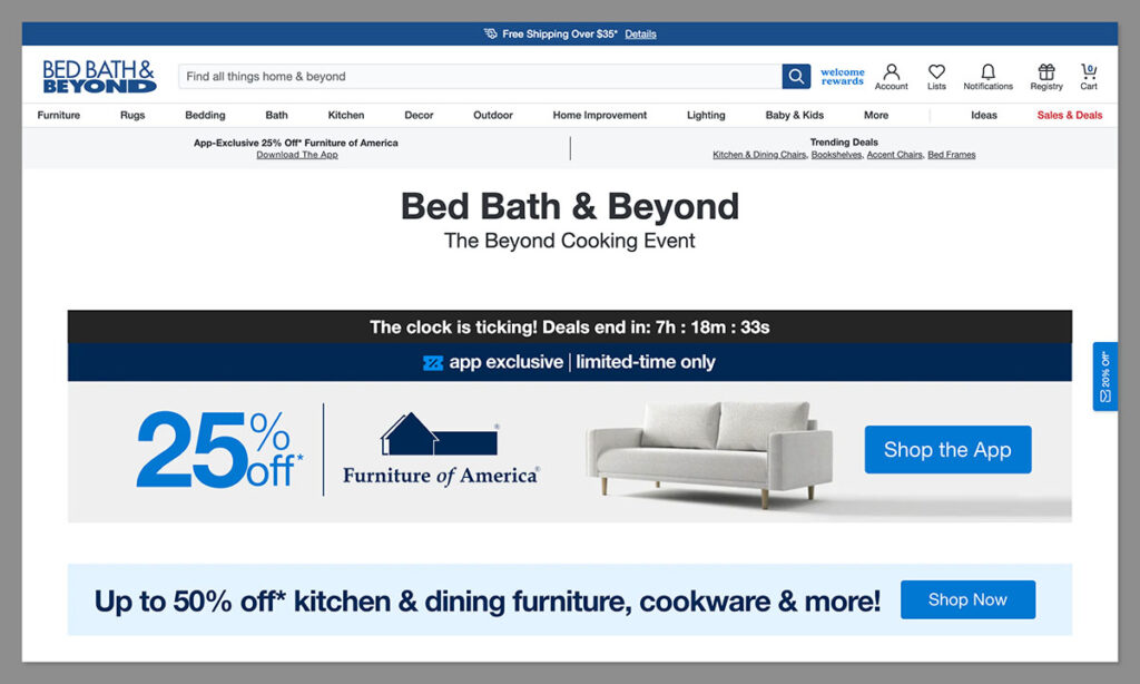
One of the biggest mistakes e-commerce stores that carry many products from various brands make is not specifying exactly which items are covered by the flash sale.
Although this looks good for key performance indicators (KPIs) such as website traffic and time on site, the disappointment of the majority of visitors in not finding what they thought was part of the sale would be counterproductive in the long term.
Once customers start viewing a particular website’s flash sales as clickbait, their meaning and impact can only deteriorate.
Bed Bath and Beyond avoids this danger by indicating right at the start of the flash web page what items are on sale, what brands are included, and what potential savings are available.
For customers who have been waiting for a specific product, they will know immediately on the page if it is part of the sale. The rest of the page shows other discounts available (although not as deep as the flash sale) and low-priced products that might interest visitors.
This way, customers who arrive on the page are likely to find something they might like even if it’s not part of the flash sale.
Additionally, Bed Bath & Beyond has a timer near the top that gives visitors an idea of how much time they have before the flash sale ends – a proven way to give visitors a sense of urgency.
2. Scout & Co. Children
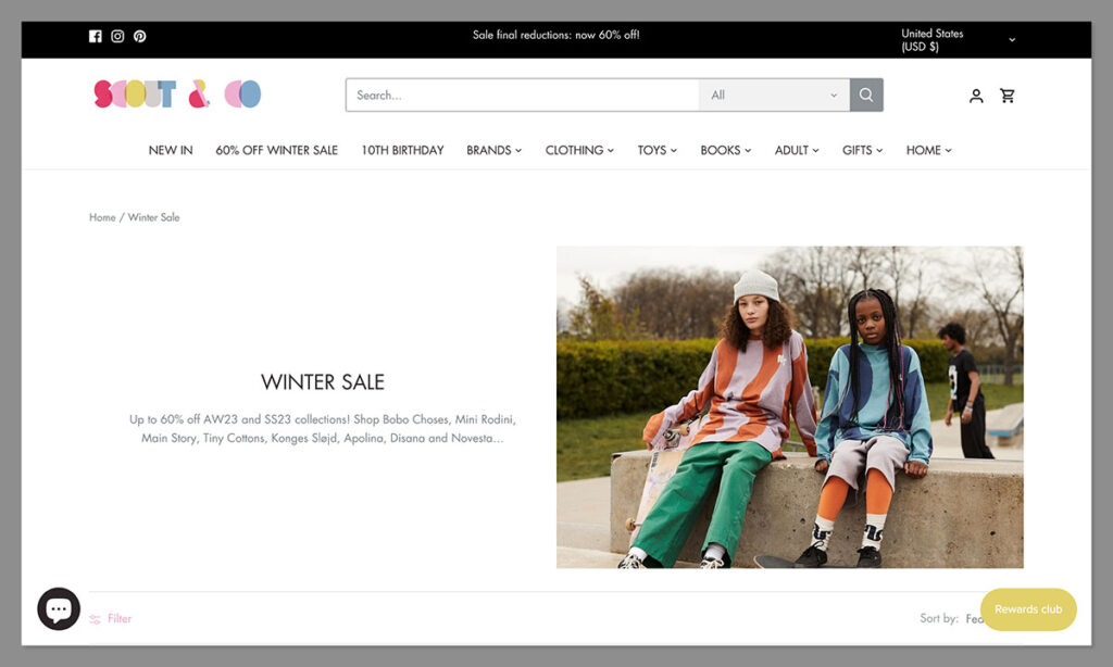
Despite the relatively targeted Bed Bath & Beyond page, the diversity of products is not necessarily an obstacle to the success of a flash sale. It all depends on how well the idea is executed and whether it is presented in an organized enough manner so that potential buyers can quickly access the exact product they would be interested in.
Scout & Co. Kids takes this approach by offering a flash sale page whose banner first lists some of the major brands covered by the offer. Subsequently, it provides a clear and organized multi-page list of hundreds of items available at a great price.
Products are listed by “featured” first so the store can show potential buyers which products they would like to prioritize when selling. An intuitive on-page filter allows visitors to zero in on the product they would be interested in by brand, size, and whether the item is in stock or sold out.
To ensure that every visitor to any page of the website knows that a flash sale is going on, a banner is shown at the top of each page.
3. Bath and body work
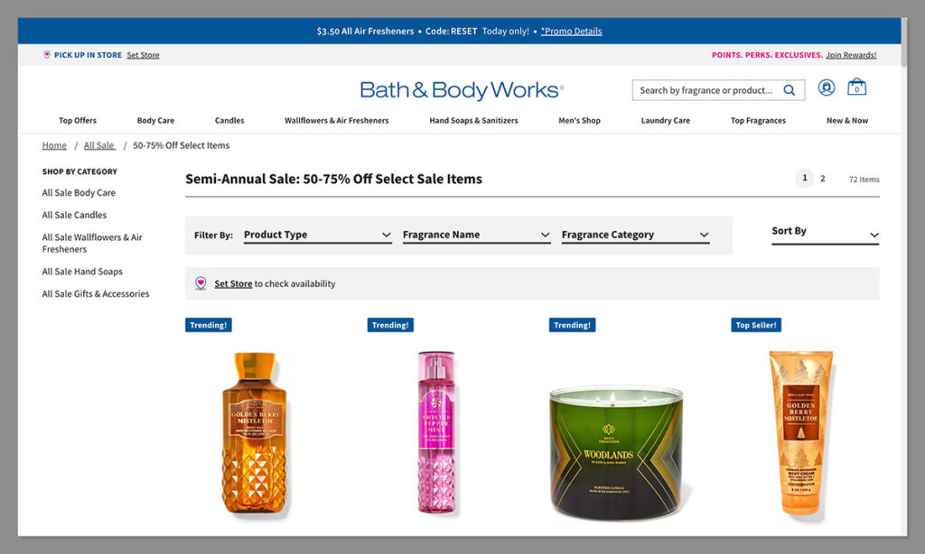
The home page is by far the most visited page on a website. If a store needs to run an ad that will be seen by the maximum possible number of site visitors, then the homepage is the most logical place to place it.
Aware of this fact, Bath & Body Works does not relegate flash sale information to a simple element in the navigation bar or to a thin banner at the top of each page of the site. Instead, visitors are bombarded by a large banner occupying much of the space above the street crease. home page.
In the ad, the store only provides as much information as necessary for the customer to know that they might be missing a lot, but little enough that they are curious enough and want to click through to the flash sale page.
In accordance with best practices for organizing a flash sale intended to trigger FOMO, it specifies the subject of the sale, the extent of the discounts available and invites the visitor to click on a button or link if they wish to find out more. On the flash sale web page itself, each item’s image is accompanied by an average rating based on reviews from past buyers as well as an indication of its availability in near real time.
4. The knitting network
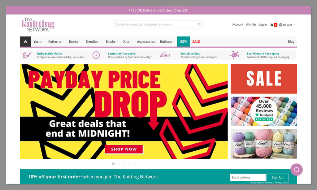
What’s the point of a flash sale if no one knows it’s happening? One of the biggest obstacles to successful sales is inadequate promotion. There are several ways a site can inform potential buyers that there are opportunities available that they might want to take advantage of. The Knitting Network makes the most of an on-site, social media-like notification feed at the top right of the page.
When visitors (whether registered users of the site or new visitors) click on the notification icon, a feed showing them the limited time sales available and especially those that are about to go live to exhaust is presented to them.
Unlike promotional emails that risk getting buried in spam folders or a sea of other emails, notifications have high visibility and give visitors the opportunity to take action on the spot on their impulse. Additionally, notifications are considerably easier to create than marketing emails and much more concise in text that the user must read before acting on the call to action (CTA).
Once visitors click on the notification, they are taken to the actual page containing the flash sale.
5. Flower
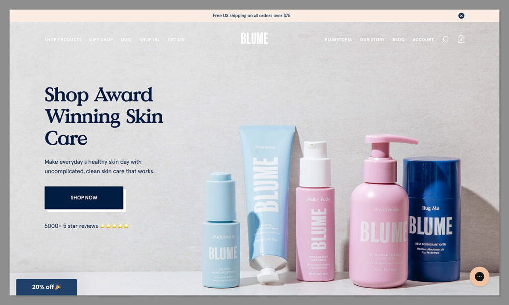
How can an online store ensure the visual prominence of a flash sale while avoiding making it a hindrance to an online shopper’s ability to seamlessly navigate the website? It’s a balance that online store owners need to think about throughout. A sale that interferes with the buyer’s journey would be doomed to failure.
Blume, a store specializing in personal care products, seems to have succeeded through clever use of minimizeable pop-ups. Typically, when presented with a popup promoting a flash sale, visitors often wonder if closing the window will mean losing the deal (because that’s what sometimes happens).
Blume customers who want to close the pop-up and continue shopping do not need to worry about this. If they choose to close the pop-up and return to the main window, all that happens is the pop-up minimizes and goes to the bottom of the screen.
And when they are ready to take advantage of the offer, they simply click on the minimized window and the pop-up returns to full-screen mode.
It’s a win-win. Customers who want to quickly access, purchase, and exit the website because they already know exactly what they want, have the option to ignore and navigate past the flash sale pop-up. Those who wish to take advantage of the sale still have access to it.
Wrap
A flash sale can generate an unprecedented amount of revenue. But like any good thing, it can only happen when deployed correctly. There is no one-size-fits-all solution when it comes to Flash web design.
Think about your brand, your overall strategy, the goals of the flash sale and determine which design is most likely to achieve your goals.
Once you’ve decided on a design and layout, monitor performance and make necessary changes to improve results for current and future flash sales.